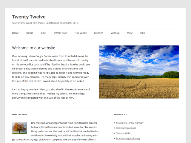
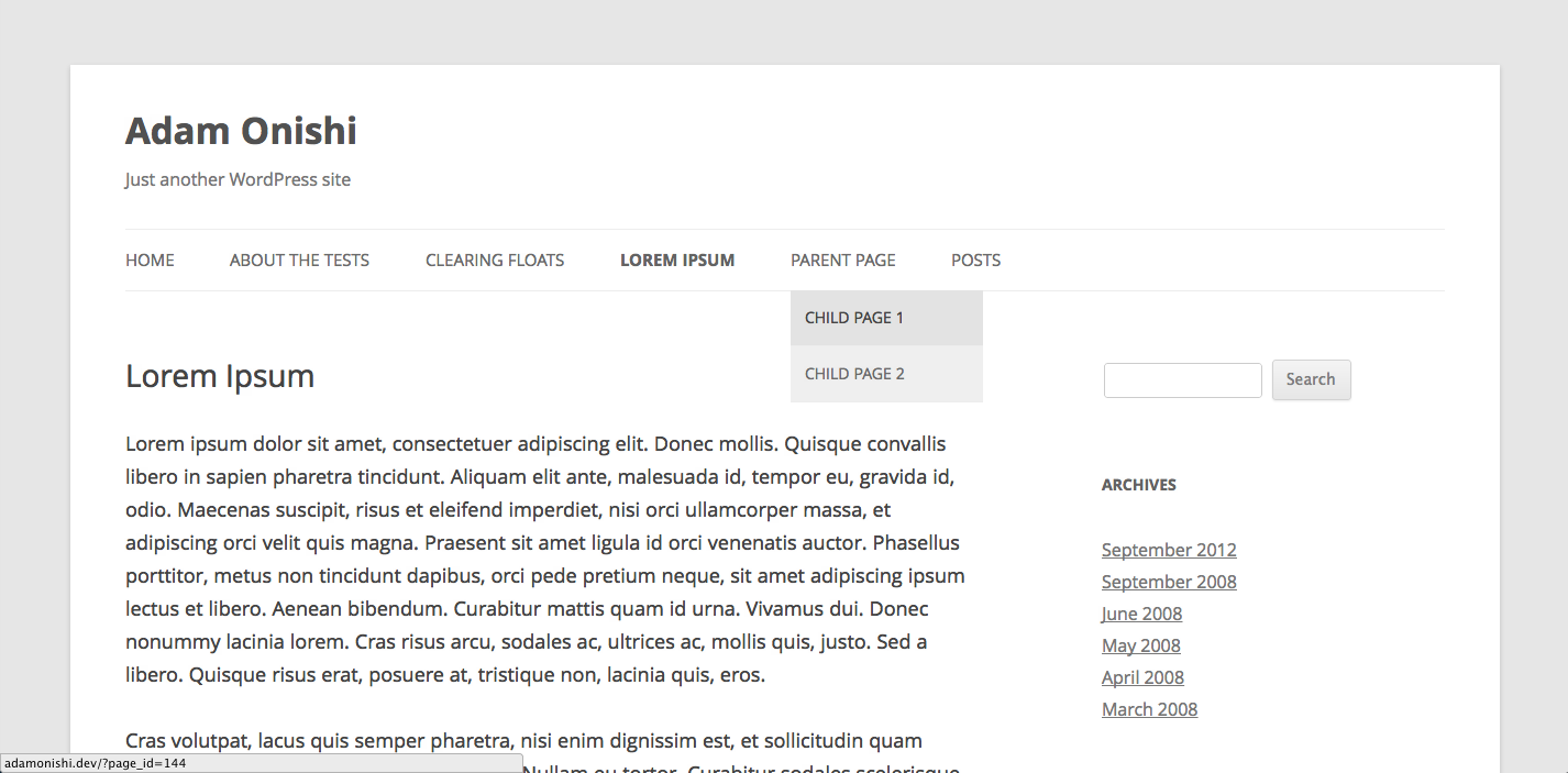
Late last year saw the release of the latest default theme offering from WordPress the next of the Twenty-somethings, TwentyTwelve.
In this post I’m going to take a quick look through what’s new in the latest default theme. What new features there are for content editors and what designers/developers can learn.
The first thing to mention however is that WordPress has now gone fully responsive! The WordPress blog calls TwentyTwelve “a thoughtfully crafted mobile-first layout”, the TwentyEleven theme did respond in size certainly, but TwentyTwelve is a much more considered execution.
New design
The new WordPress default theme has certainly put a lot more emphasis on a content-driven approach to design. It’s very minimalist with a lot of whitespace and clean/clear navigation both on desktop and a nice execution on mobile. The typography of the TwentyTwelve theme also adds to it with the fantastic Open Sans typeface served via Google Web Fonts.
WordPress is now seen as much more than just a blogging platform, this too is clearly echoed in the new theme - perhaps controversially so. There is now a new homepage template design, taking away the post listing and giving you the chance to use a custom page as your homepage with 2 widget areas.

Other features include the introduction of a full-width page template removing the sidebar where you choose, another example of the content-first nature of the theme. And post formats are now carried over to the single post pages where in TwentyEleven the formatting found in the post listing would be lost in the single page template.
New development techniques
The new TwentyTwelve theme also looks pretty different when you dig down into the code and see the various changes introduced. For starters the <head> declaration has come down from 44 lines of code in TwentyEleven to just 10 lines in TwentyTwelve, mainly by moving more functions into the functions.php. That also includes the main stylesheet call being applied with wp_enqueue_style():
// Code

/*
    * Loads our main stylesheet.
*/
wp_enqueue_style( 'twentytwelve-style', get_stylesheet_uri() );
Speaking of the stylesheet, lots of work has gone into making this a truly responsive theme and this can be seen no better than in the use of REMs in the stylesheet for all of the main sizing for the theme. Meaning the design will also respond well to adjustments made to the default text size.

As mentioned earlier there are 2 new page templates available in the TwentyTwelve theme, front-page.php and full-width.php which can be found in the page-templates folder. The front page template will get called if a custom home page has been used for the theme and pages will be styled the same as the full-width page template should the user remove all widgets from the main sidebar.
The new offering from WordPress in the TwentyTwelve theme clearly shows how well WordPress has evolved over the years to become one of the top content management systems on the web. There’s a reason over 56 million websites are powered by it. The new TwentyTwelve theme clearly shows that they are continuing to develop with the times and the industry.